Ed-tech
How I reimagined Neovarsity’s backend portal to consolidate persona-specific actions
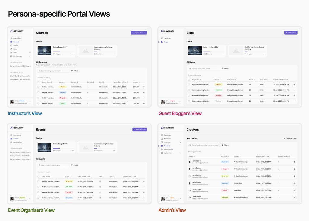
Transforming an admin-only system into a unified platform for multiple personas such as instructors, guest bloggers, event organisers, and admins, enabling them to take control, increase usability, and boost efficiency.
My role
Research, Strategy, Design system, UI Design
Team
1 designer, 1 developer
Timeline
3 months
Outcome
A comprehensive portal with reduced friction and boosted efficiency & usability for core tasks
Let's start with some context
Neovarsity is an ed-tech platform specialising in deep tech domains. Initially, Neovarsity onboarded instructors to create these programmes and, in doing so, extended the admin backend portal (used to display these programmes on the frontend website) for creators. However, the backend portal was originally designed as an admin tool rather than a creator space. This quickly became a hurdle for many, as it was not convenient to use, resulting in limited instructor retention. Now, as Neovarsity evolves towards a marketplace model, this mismatch has become even more evident.
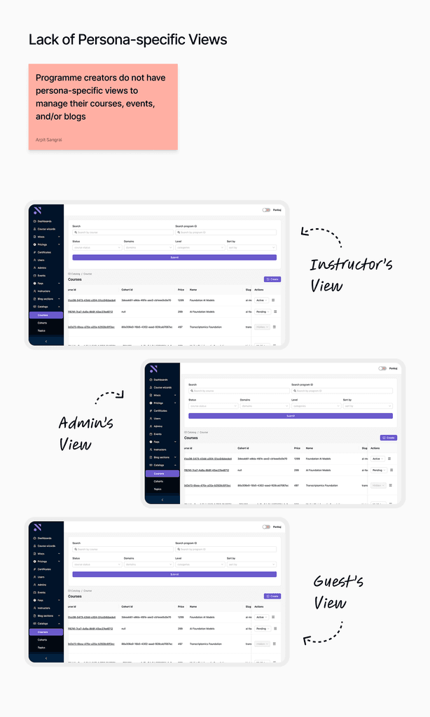
The portal wasn’t built for programme creators, but around them
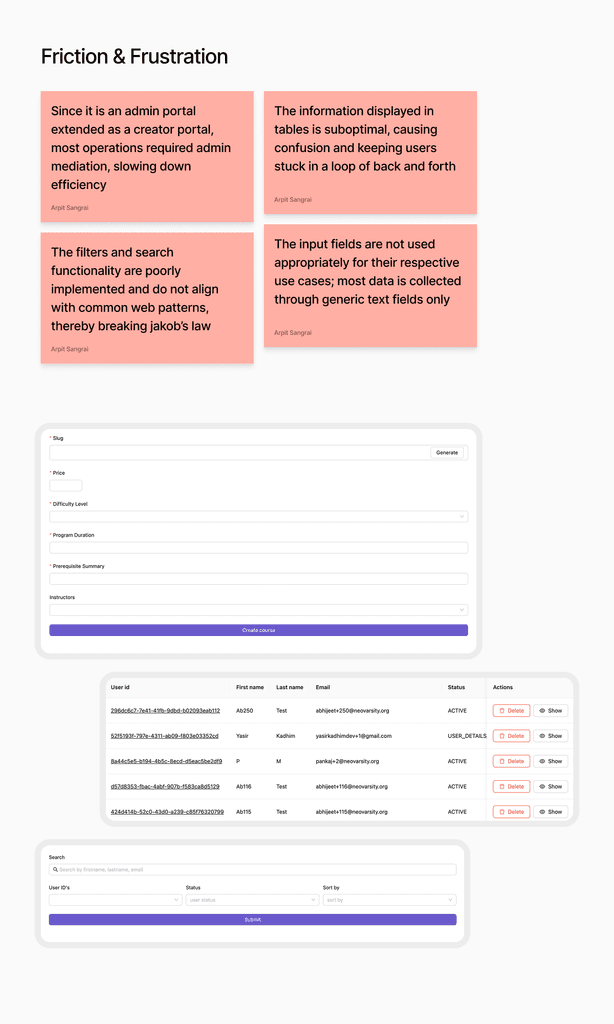
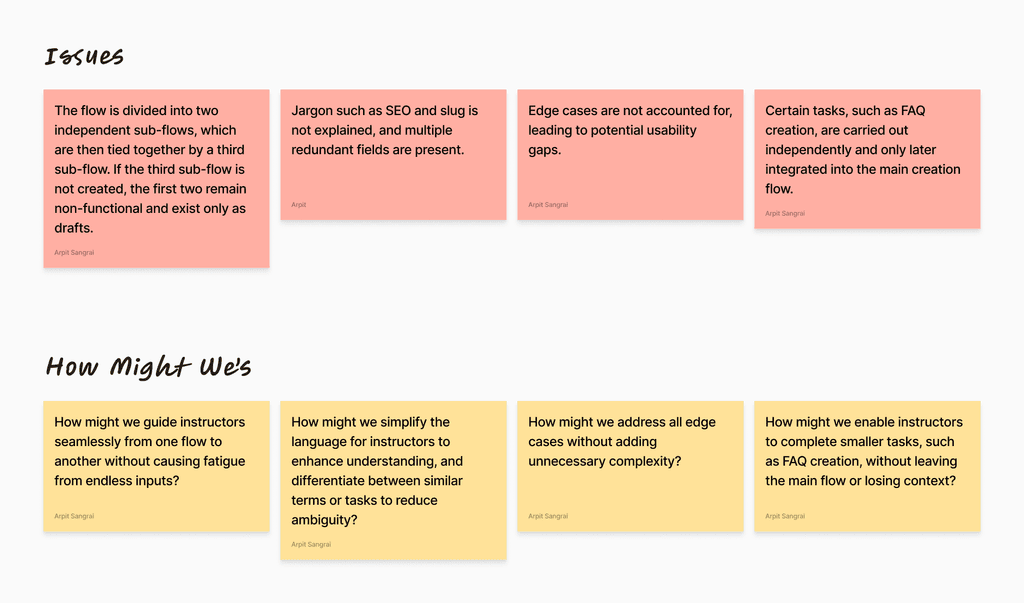
The core issues that prompted a restructure were:


Conceptualising a creator-first portal
The goal was simple. Reimagine the entire platform as a creator-first portal that:
Empowers creators to manage everything independently through their own individual portal views.
Integrates performance and analytics insights, enabling creators to make informed decisions about their programmes.
Simplifies content creation flows (courses, blogs, events) to reduce friction and boost efficiency.
Laying down plans, flows, & systems
While planning, I realised that the information architecture for instructor view could form the foundation for all other views since an instructor has all functionalities that guests bloggers and event organisers would have and more. So, I began by mapping the existing architecture and then refining it around the instructor's view. This process involved removing redundancies, merging similar steps, and adding nice-to-haves where they enhanced efficiency or clarity.
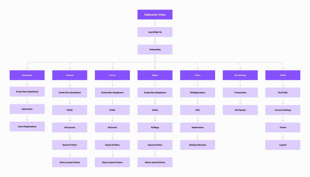
new information architecture for instructor view
Among all redesign flows, the most critical was simplifying the content creation processes, primarily for courses, which involved multiple steps, and secondarily for events and blogs.
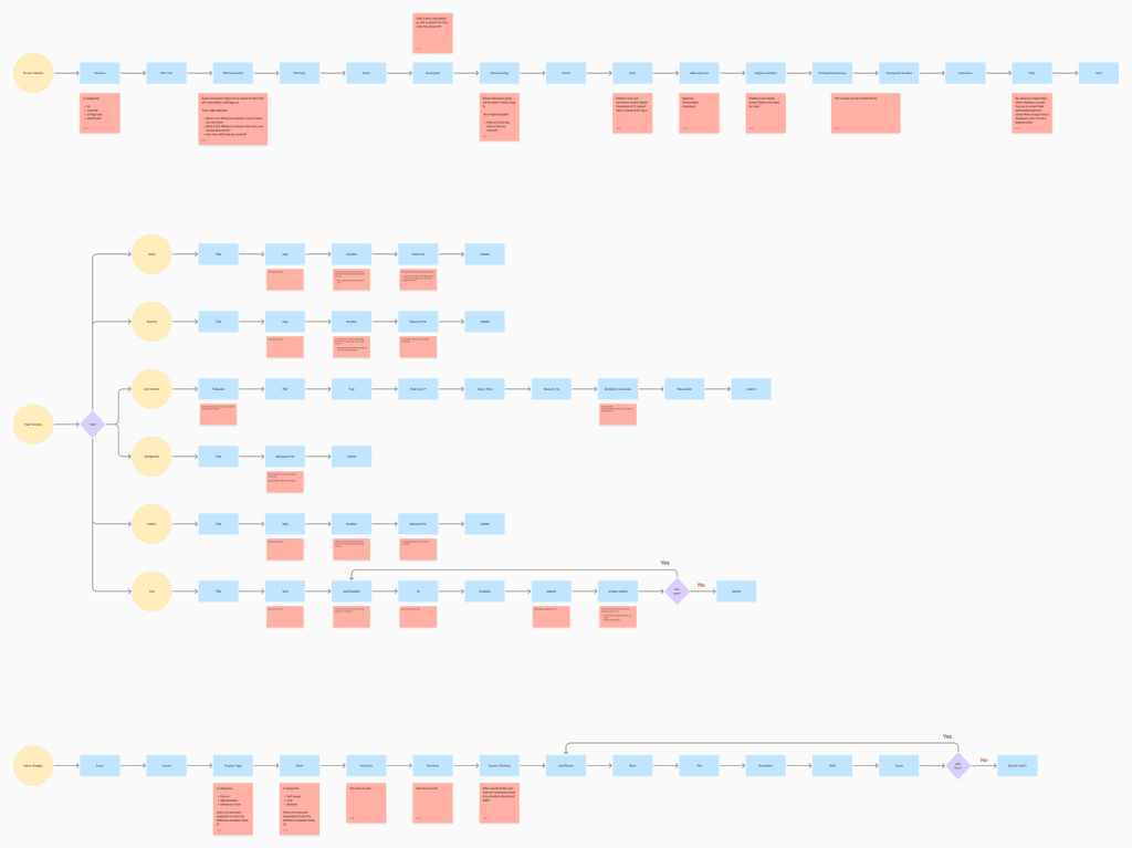
old flow for course creation
Apart from its discontinuous nature, the old flow had a lot of other issues which were resulting in increased no. of clicks to accomplish the task.
In the new course creation flow (v0) curated, the first and foremost issue solved was the discontinuous nature of the process by connecting all the three parts of the flow. Next, by making use of UX laws such as chunking, progressive disclosure, and the goal-gradient effect, I divided tasks within these three parts into smaller goals for the user to complete, reducing frustration and boosting efficiency.

insight from a conversation with an instructor
This insight led me to rethink the flow: what if we let them dive straight into creation as the first step, with automatic draft saving for later continuation? I restructured the initial version accordingly, and upon reevaluation, instructors expressed a clear preference for this approach. Hence, the new flow (v1) was finalised. (Similarly, the blog creation flow also starts with content creation before moving on to metadata.)

v0 flow for course creation

v1 flow for course creation
While restructuring, it was important to retain a layer of admin control to maintain Neovarsity’s content quality. The challenge was to place this layer strategically so that it didn’t create friction for creators.
There were two possible approaches:
Allow instant uploads to the website and review them post-publication, or
Require instructors to submit their content for review before it goes live.
The latter proved more effective as it ensured content quality while avoiding negative feedback from premature uploads.
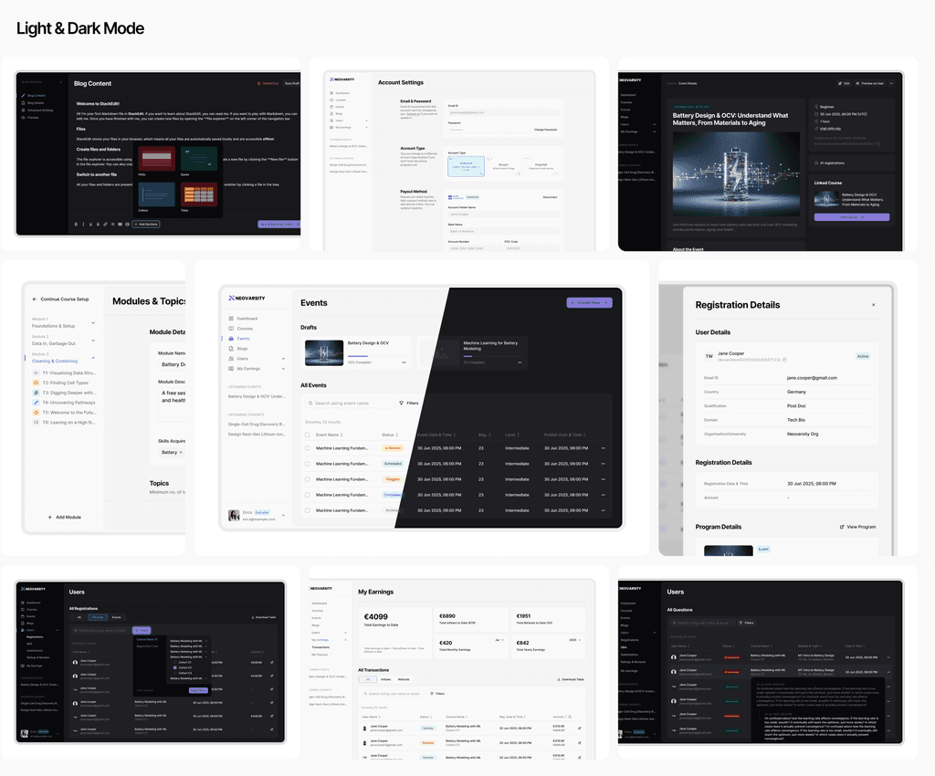
A comprehensive web portal solution
After dozens of iterations for style choices and UX decisions, the product came together.

The outcome
Onboarded 5 new instructors with an 80% retention rate (as of now).
A total of 7 programmes went live within 2 months, compared to 3 previously, indicating a roughly 133% boost in efficiency.
Reduced friction and frustration among instructors, as inferred from the improved outcomes.
All the things I learnt from this project
Adapting pre-built design systems isn’t a shortcut, it’s a design decision that can accelerate progress during time constraints when customised well.
Never overlook shared actions and goals within the broader system. Recognising them helps create a more cohesive and seamless experience.
User behaviour should always drive logic, not assumptions. Observing real workflows reveals insights that shape more meaningful product decisions.
Thanks for your time ❤️
More in projects
2025 Arpit Sangrai. All rights reserved.
Made with love and lots of caffeine