Food-tech
How I redefined the in-dining experience for Aria
Strategized and designed the in-dining experience to enable hospitality teams to offer faster service, boost customer spend, and deliver better experiences, all without adding operational complexity.
My role
Design, Strategy, Design system, QA
Team
1 designer, 2 developers, 1 product manager (a.k.a. the CEO)
Timeline
2 months
Outcome
A mobile first web app
The beginning
Something had to change.
Let me paint a picture for you.

5 friends walk into a restaurant for a casual lunch. Easy enough, right? Not quite. With only two menus to share, deciding what to eat turned into a group negotiation. By the time they finally agreed, the restaurant was packed, and no waiter was free to take their order. 7 minutes (and some awkward hand-waving) later, they managed to order. But the real chaos started with the bill. Out came the calculator, the receipt, then the calculator again... until everyone paid their share via Apple Pay. What should have been a fun, relaxing lunch turned into a logistical nightmare.
Envisioned as a comprehensive, digital-first dining solution, Aria was designed to simplify the entire experience while also helping restaurants increase efficiency and profitability. I was tasked with transforming that vision into a user-friendly product.
The history
Aria officially kicked off in November 2023 as a native iOS app. At that stage, our positioning was fuzzy, so the plan was: “let’s design it like a native app, and if it ever needs to be a web app, we’ll tweak it.”
Without a defined design system to guide the handoff from design to code, things quickly got messy. The app existed, but it didn’t quite serve its purpose. Looking back, this phase felt less like product design and more like creative freefall (fun, but not very useful).
During this exploration, we toyed with wild ideas such as a conversational AI to help indecisive diners pick from the menu, table booking and directions baked right into the app, and other "wouldn’t-it-be-cool-if" features.
The problem? We were wandering off into shiny possibilities without solving the actual pain point first. So, after 3 months of experiments, we pressed pause. Aria went into hibernation for about a year.


aria old version (native app)
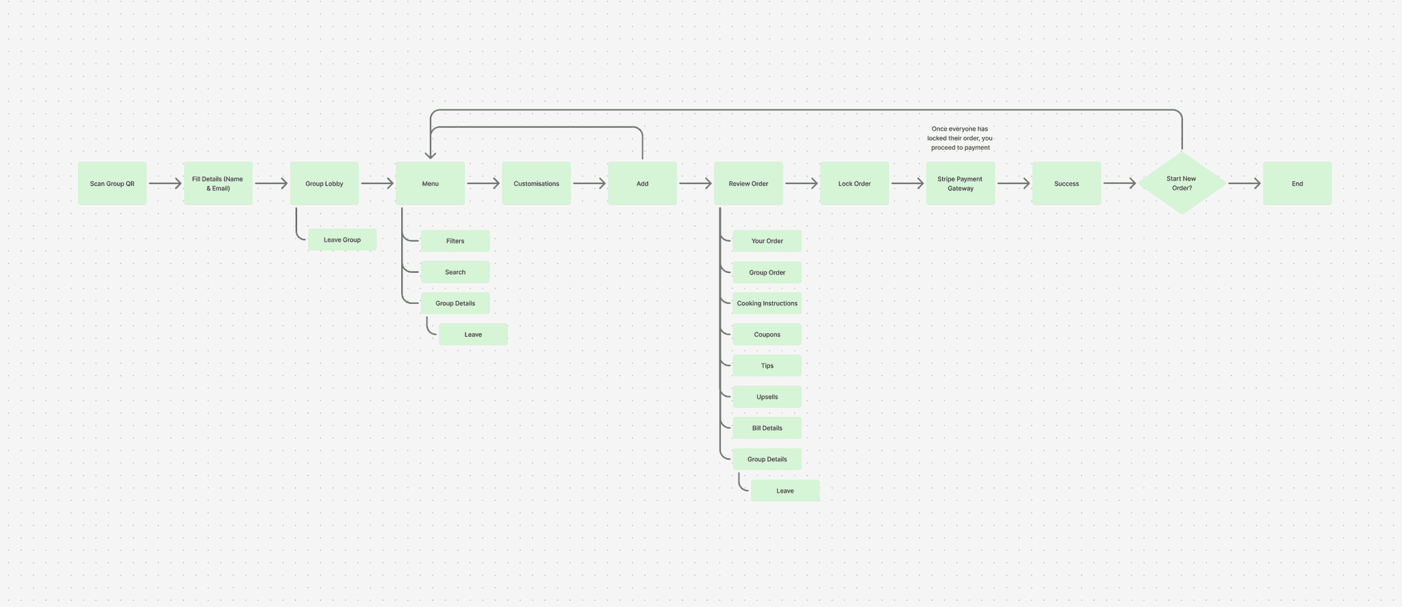
Crafting the solution a.k.a. the user flows
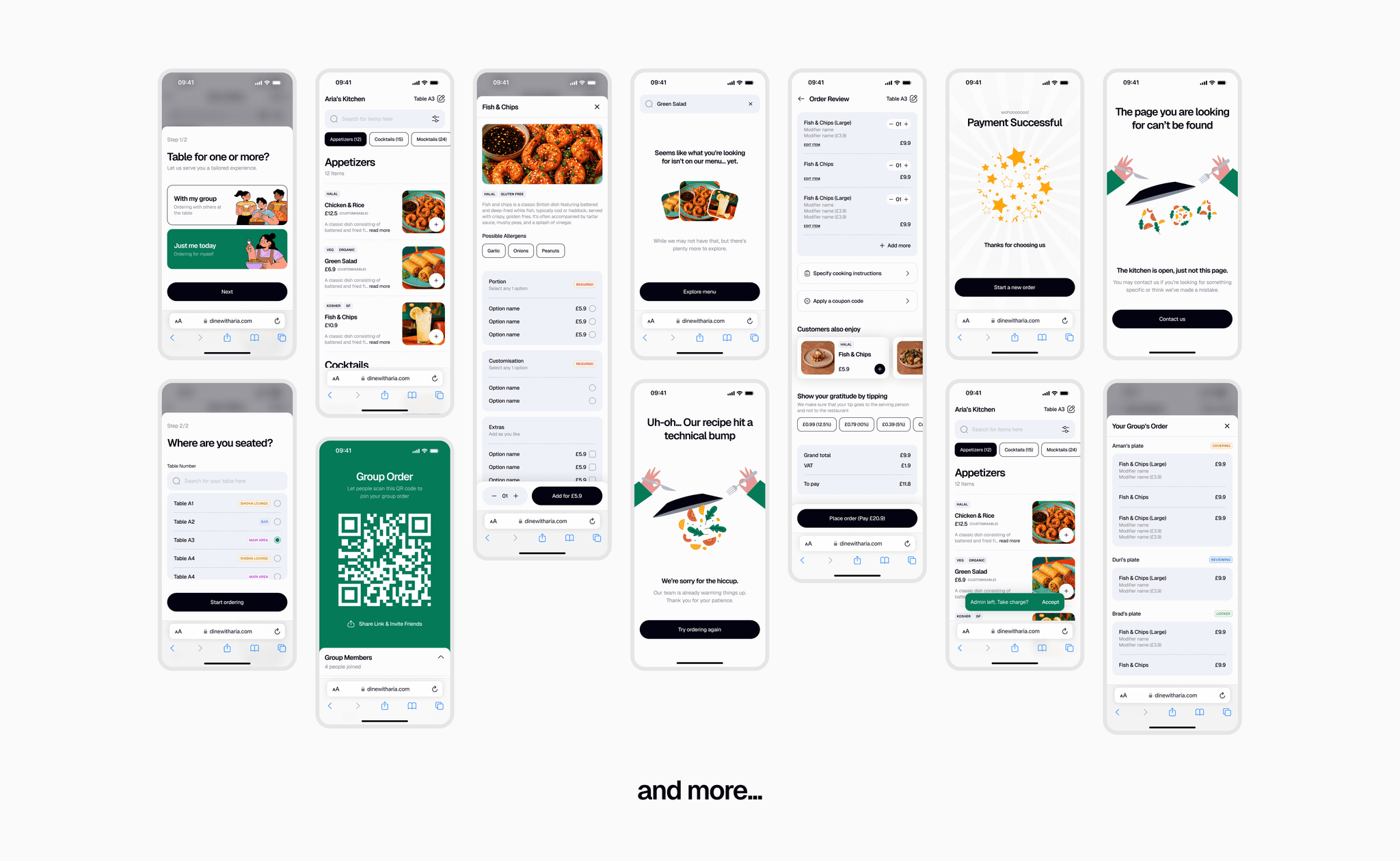
When we came back in June 2025, it was with a fresh mindset and a clear agenda: start small, stay focused, and solve the core problem first.
I began refining the original user flow to align with Aria’s vision of a frictionless web app, one where users can dive right in without the hurdle of creating an account first.
The solo ordering flow was the simplest to design, so it became the foundation upon which the more complex group ordering journey was built.
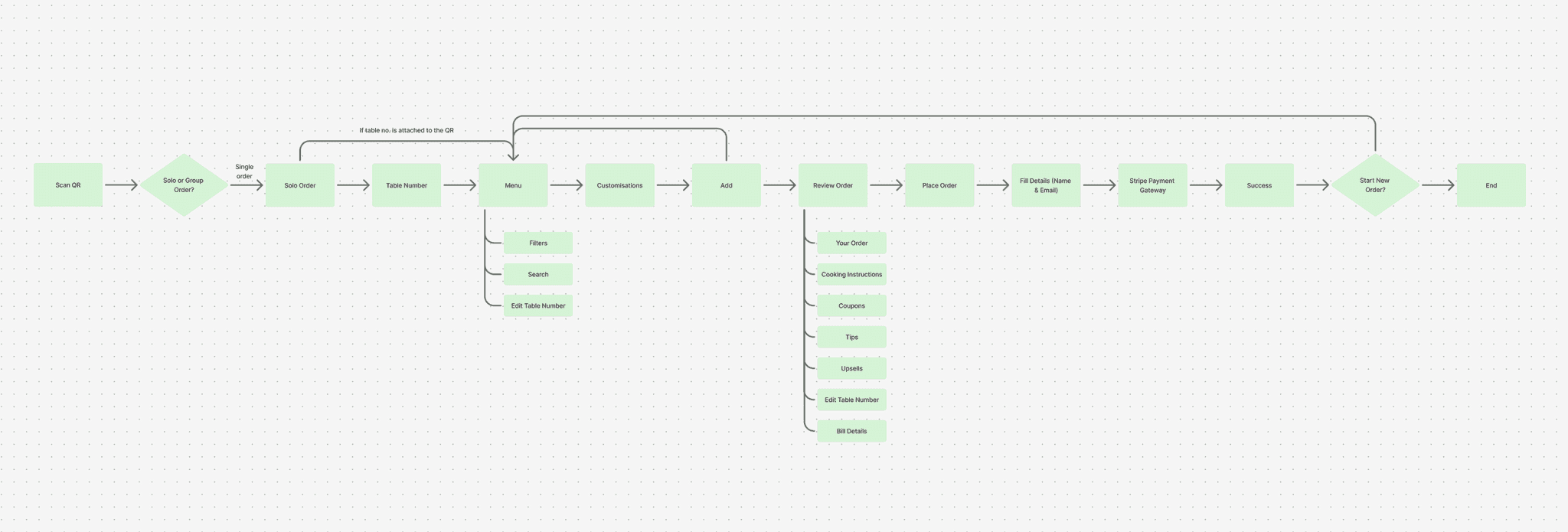
userflow for solo ordering
One member became the admin by scanning the QR code on the table to initiate the group order. The rest could join either by scanning the unique QR generated on the admin’s screen or through an invite link the admin shared via their preferred communication platform.
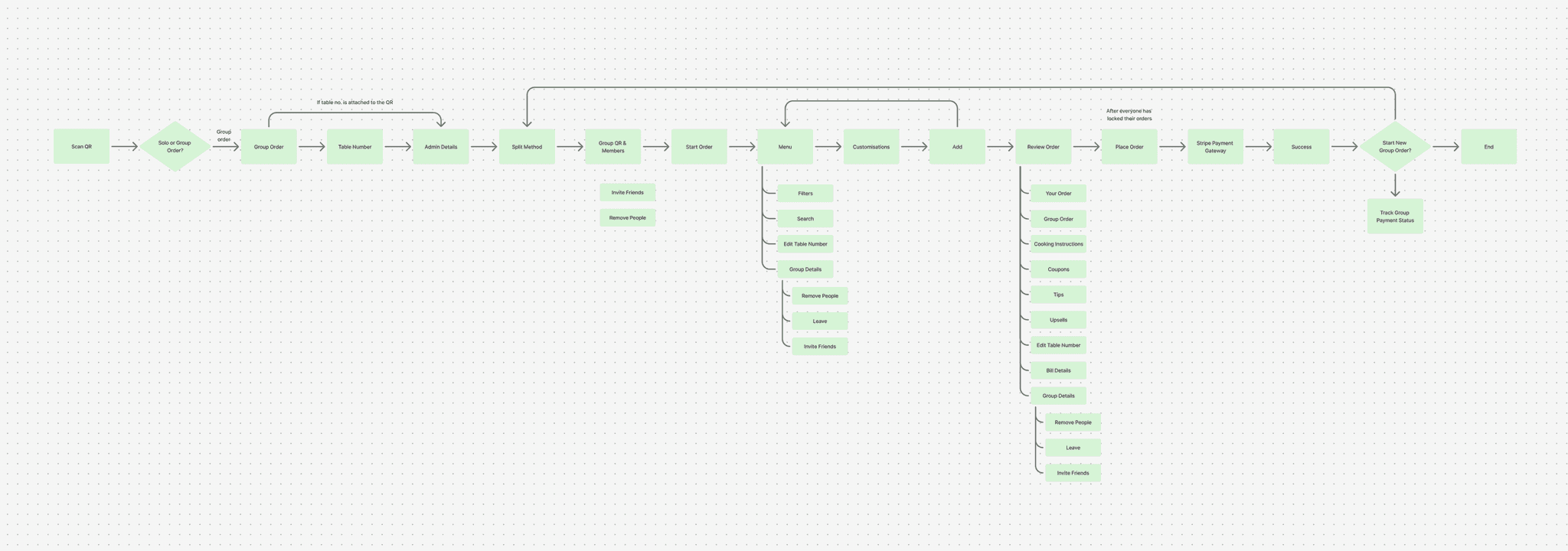
userflow for group ordering (admin side of things)
userflow for group ordering (joiners side of things)
Group ordering came with multiple edge cases that I made sure to have had addressed. Some of those were:
Latecomer scans after group is locked
Admin tries to lock before others are ready
Admin leaves before locking group
and more...
The design system
I started with the color system, which brought a major shift in Aria’s brand identity and help set the right emotional tone of the product.
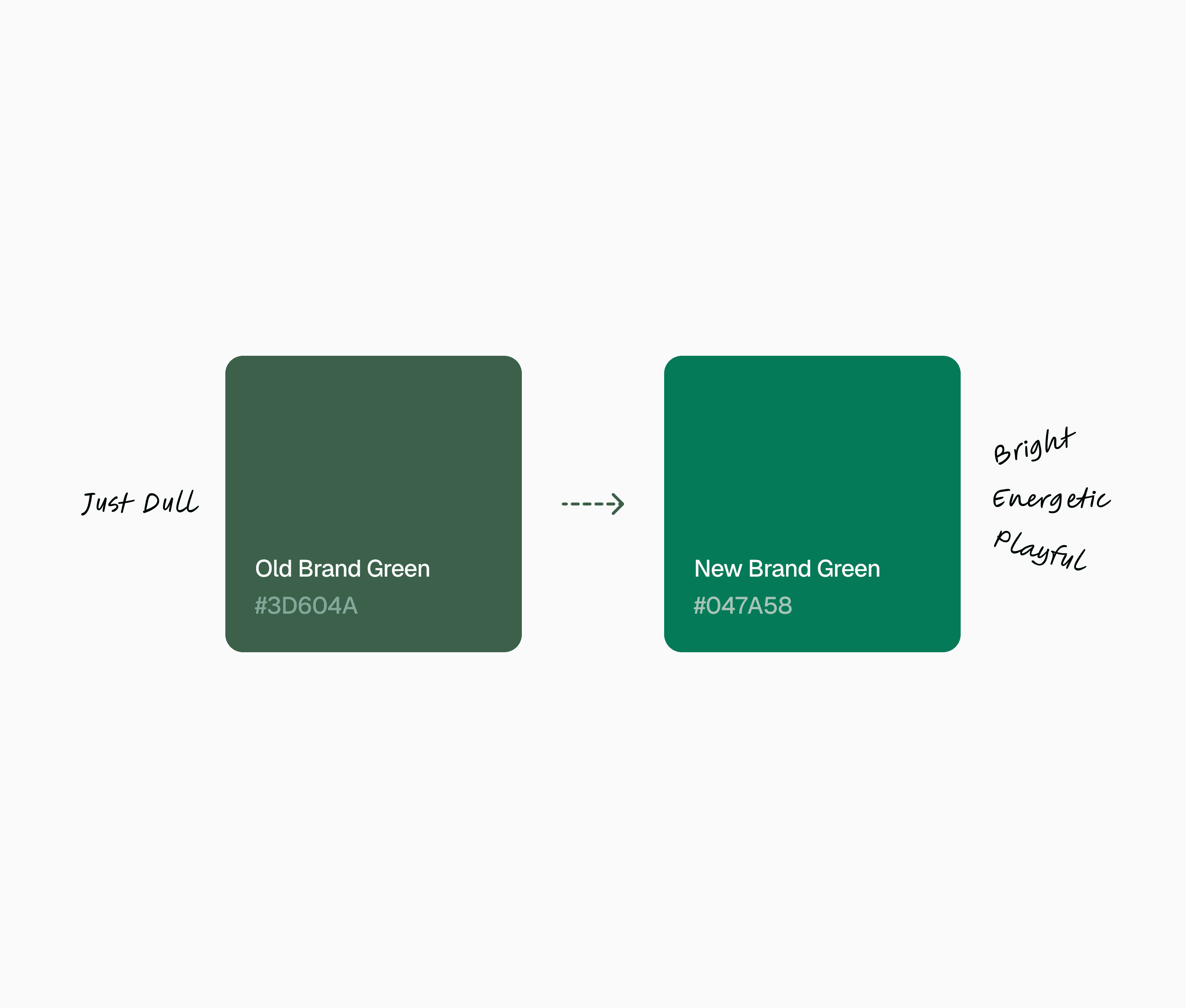
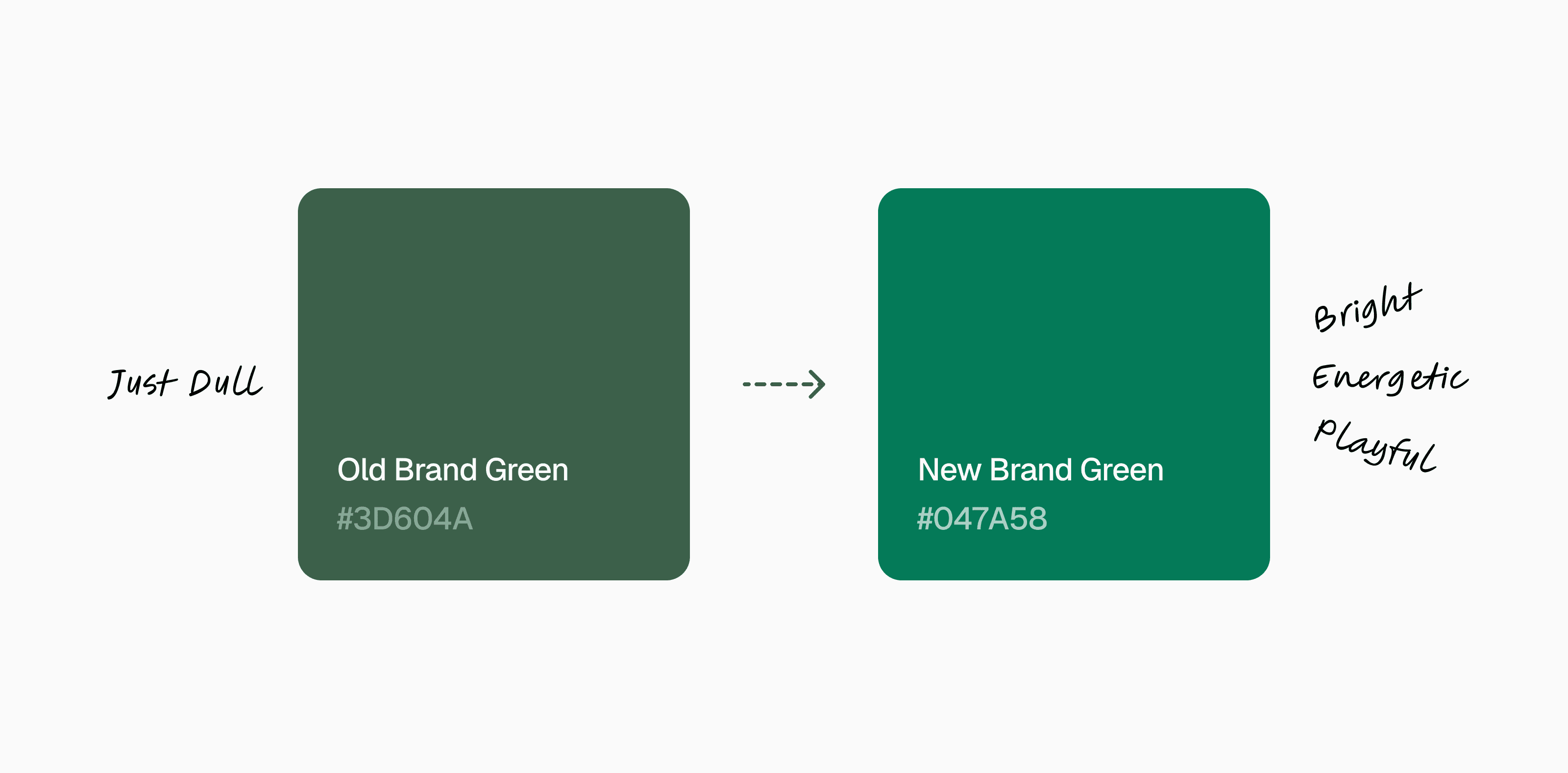
I implemented the system using local variables in Figma, ensuring consistency and scalability across the design.

color sytem
Next came the type system. While we had been using "Plus Jakarta Sans", I realized that to fully embrace Aria’s bold, playful, and energetic vibe, we needed a typeface with more character while still maintaining legibility and accessibility. I settled on "Geist" for its liveliness.
Menu
Plus Jakarta Sans
Menu
Geist
Once the new typeface was chosen, I defined a typographic scale aligned with use cases, implemented as Figma variables and styles for flexibility and efficiency.

type sytem
unit system
iconsax icon library
To round out the foundations, I curated a set of standard effects tailored to our needs: background blur, layer blur, and drop shadow. These effects added depth and clarity without overwhelming the interface.

effects
Finally, with the atoms in place, I began assembling molecules and components. At this stage, I designed only what was necessary while leaving room for scalability as Aria grows. Having these designed beforehand significantly saved me time during UI design and helped bridge the annoying gap between designer and developers.
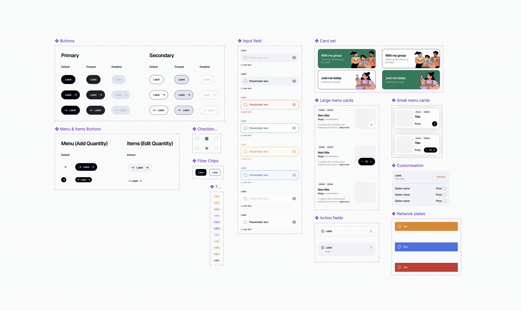
components
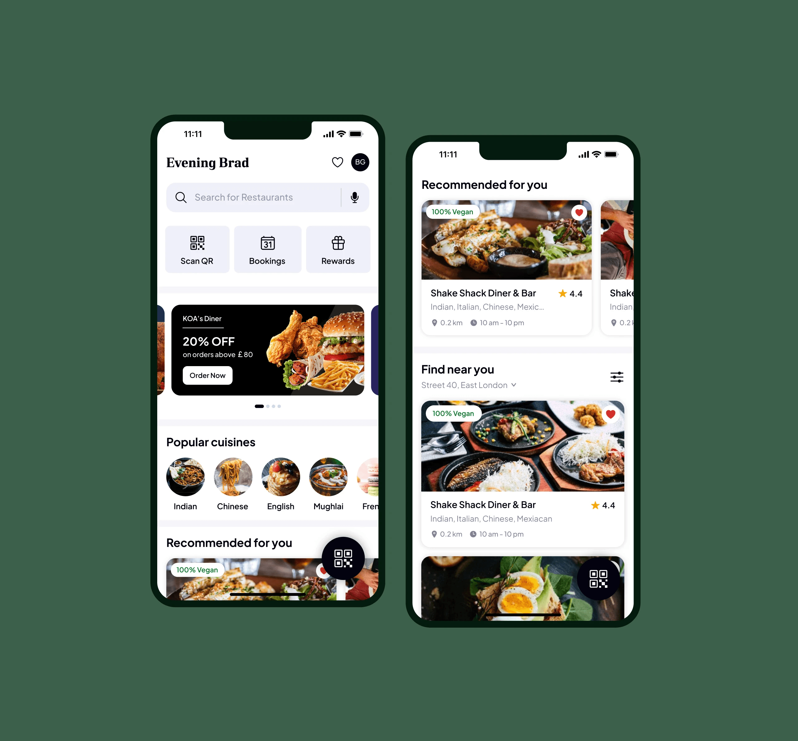
One platform for mobile ordering, payments, & fair bill splitting for groups
This version of Aria focused on one clear mission: reduce complexity and enhance the dining experience. While we deliberately kept the scope lean for launch, the future holds exciting possibilities, features that can elevate Aria to entirely new levels. With launch planned for the end of 2025, I’m eager to see how Aria will reshape casual dining and even more excited to share the impact it creates.
the final product
My learnings
Design system is crucial to a cohesive experience. Without it the product can fall apart quickly.
Always solve for the core pain point first and then build features around it that uplifts the experience.
Iterate and then iterate some more.